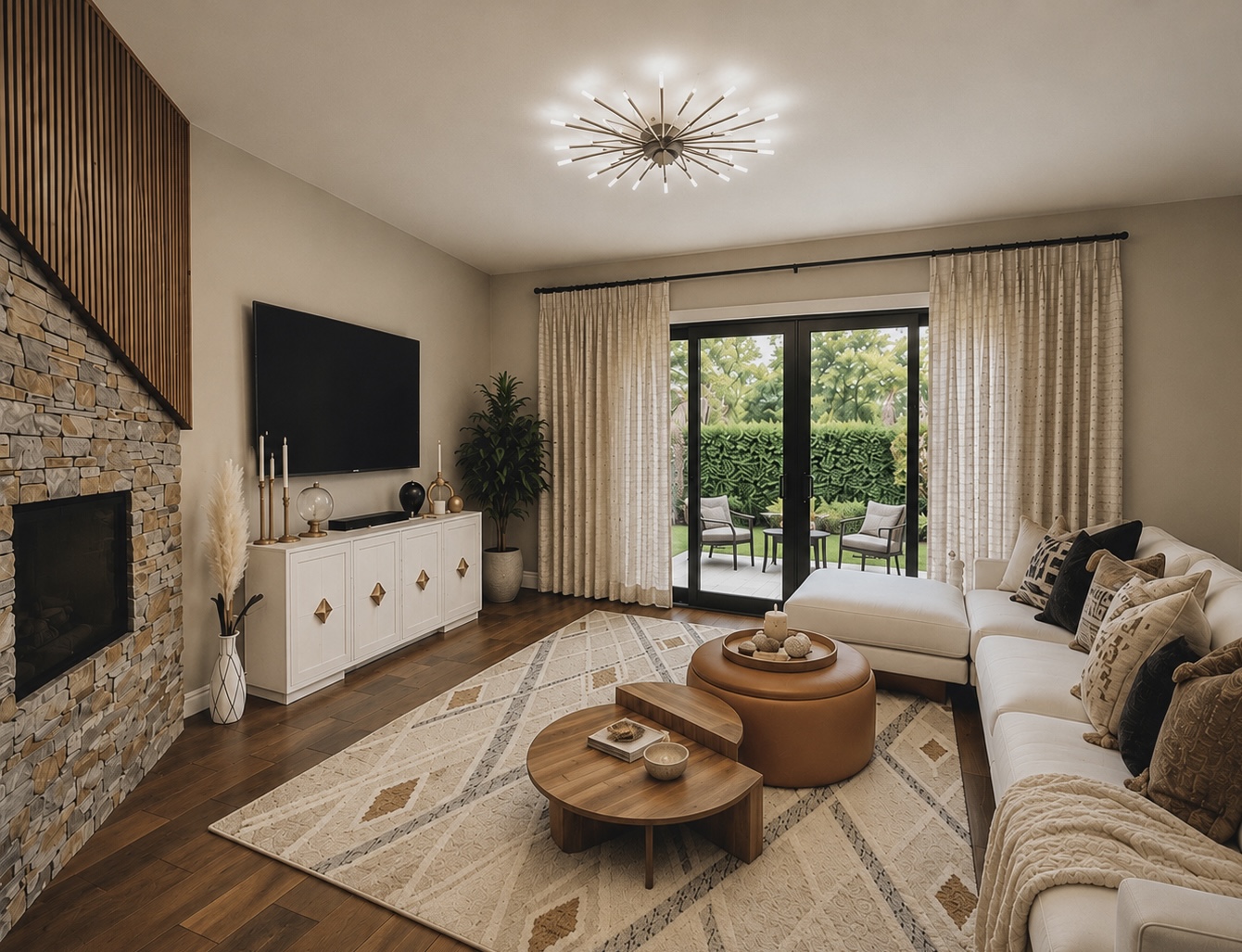
The Art of the Conversation Area
Most living rooms are organized around a screen. The best ones are organized around people — and the difference in how a room feels, and how it gets used, is complete.
There is a version of the living room that almost every home has: furniture pushed to the walls, a sofa aimed at the television, and an open center that nobody knows what to do with. It is a room you pass through rather than a room you inhabit. The scale might be generous, the finishes might be beautiful, but the layout works against connection — and connection is the entire point of a living room.
Diagnosing the Empty Center
When I first walked into the living room in this project, I immediately understood the problem. The ceilings were high — over eleven feet — and the homeowners had responded by pushing every piece of furniture as close to the walls as possible, as if trying to fill the perimeter. The result was a large, impressive room that felt completely unusable. The sofa was so far from everything else that a conversation required raising your voice. The scale that should have been the room's greatest asset had become its biggest obstacle.
This is one of the most common instincts in large rooms, and it is almost always wrong. Furniture pulled to the walls does not make a room feel larger — it makes it feel emptier. The eye reads the space between pieces as absence rather than air. What actually makes a large room feel resolved and human-scaled is the opposite: furniture pulled toward the center, arranged with intention, so that the space between the seating group and the walls becomes a deliberate surround rather than dead zone.
Building the Seating Group
The fundamental unit of a conversation area is a seating group — a collection of pieces arranged so that people face each other rather than a screen. In this room, we anchored the group with a deep green velvet sofa along one axis and positioned two leather swivel chairs across from it. The swivel chairs were the pivotal decision. They allow whoever is sitting in them to rotate toward the sofa, toward the entry, toward a guest standing nearby — they make the seating flexible without making it feel unstable. In a room where multiple conversations might happen at once, that adaptability is essential.
A geometric coffee table occupies the center of the group — close enough to be useful, with a surface that holds drinks, books, and objects without visual clutter. The table's form creates visual geometry that holds the group together. It is the piece that makes the other pieces feel like they belong to each other.
The rug defines the conversation zone. I sized it generously — front legs of every piece sitting on the rug — so that the seating group reads as a unified space within the larger room. A rug that is too small fragments the group; it suggests that each piece arrived independently rather than as part of a considered whole. When the rug is right, the group feels settled.
Using Ceiling Height as an Asset
High ceilings are one of those features that clients love when they see them on a floor plan and then struggle with once they're living in the room. The vertical space draws the eye upward, which is wonderful when you have something worth looking at up there and disorienting when you don't. The solution is not to ignore the height — it is to address it directly.
In this room, we selected a statement light fixture — a large-scale pendant with architectural weight — and centered it directly above the conversation group. The fixture does several things at once: it gives the eye a landing point in the vertical space, it defines the seating area from above the way the rug defines it from below, and it brings the perceived ceiling height down to a human scale within the group without lowering it anywhere else. The room still reads as tall, but it no longer feels exposed.
Lighting temperature mattered here as much as fixture selection. We paired the statement pendant with layered ambient lighting — sconces and table lamps that warm the perimeter — so the room has range. Full brightness for daytime use, a lower combination of sconces and lamps for evenings when the quality of light becomes part of the atmosphere.
Storage Without Disruption
One of the persistent tensions in living room design is the need for storage versus the desire for clean visual space. This room had real storage needs — media equipment, books, objects accumulated over years of living — but I was not willing to let a wall of cabinetry fragment the room's architecture.
The answer was a credenza along the far wall: long and low, with a surface that doubles as display space. It provides substantial storage without rising into the sight lines from the seating group. The objects placed on top of it — a lamp, a few meaningful pieces, a plant — give the wall weight and life without competing with the conversation area. The credenza grounds that side of the room and gives the eye somewhere to settle when you look across the space.
The room went from a pass-through to a destination. The homeowners say they actually sit in their living room now — something they hadn't done in years. The swivel chairs were the key: they let you face whoever you're talking to.
That is what a well-designed conversation area does. It does not just look good in photographs — it changes how a room gets lived in. People stay longer. Conversations run deeper. The room earns its square footage by becoming a place where something actually happens.
A living room that centers the television is a room organized around passive consumption. A living room that centers the conversation is a room organized around the people who live there.
The furniture arrangement is the message. Make sure it says the right thing.
Back to All Articles